
25 Things About Me Project.
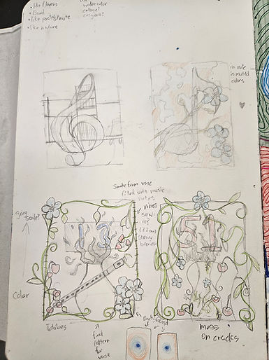
This mixed media artwork was inspired by 4 main words I felt had a meaning to me. The 4 words were Love, Flower, Plant, and Home. From the perspective of the artwork, you are looking through the window into the living room of my home. I felt i have a personal connection to the word home due to my finding it as a place of comfort. I chose the word flower due to my having fond memories of my grandmother, who used to have fake light blue "Forget Me Not" flowers in both her front and back yard. With the word love, I wanted it to be hidden but also visible after you notice it, so I hid a heart on the vase. With the word plant, I chose to use paper and yarn for both a 3D effect and texture, so it wasn't made of only paper. I used Watercolor, Paper, Colored pencils, Gold Acrylic paint, and crayons. The gold cracks on the vase help show that yes, it broke, but those scars can be made or healed into something beautiful.
Sketches For "25 Things About Me" Project


Spooky Ghost Painting
The Spooky Ghost Painting was taken by a photographer on Instagram that felt relatable to me. I first started with the base colors of the sky and the sand leaving the outline of the ghost so I knew where it was. I then blended the bright blue into a navy blue to help scale the painting. After that I started with the darkest elements of the fabric of the ghost then slowly started adding white to the grey I used until it smoothly blended together. After I added the foam of the ocean and the shadow on the sand made from the ghost. I then used black to add the sunglasses the ghost is wearing then white for the clouds in the sky. I then added small touch ups and highlights with white, dark grey, light grey, and blue when the sky needed to be touched up.

Realistic Fruit Painting
This realistic fruit painting was, my personally, a challenge due to the shading of the skin and how the inside of the fruit looks. I chose to pick a dragon fruit due to my love of the name, but also my wanting a challenge and wanting to learn how to shade in both grey scale and in color. I personally love how I was able to show a bit of value in the skin, but not make it look unnatural. I personally believe I could have done better and chosen a not-so-bright purple for the magenta dragon fruit, and be able to made it a little more red than it is blue. I wish I had also added a bit more blue to the white part of the background so the white dragon fruit can sort of pop out instead of looking a bit bland.


Anything But A Canvas
This project was challenging at first when we got the task of choosing what to paint on, due to all the options we could have chosen. I personally wanted it to be unique and different, but after bringing it down to two options, a CD and a mirror, I chose a mirror due to me being able to use it, and it had a unique texture to paint on. The most challenging part of this painting was the Semi-Realism with the Koi fish due to the fact that I wanted it to have a sort of cartoon look, but also some realism, so I wouldn't finish the project too early. My favorite part of the painting was when I decided to paint the back of the mirror since I didn't have to worry about fingerprints on the glass. I wish I had made the pink flower more symmetrical and even. I loved how the water came out on both sides and how, on the mirror, the blue fades to white, and the white fades into the mirror.
Water Color - Beyond the border
This project was fun to make. When I heard that we could choose an animal, I decided to do a butterfly and make this piece about my 4 years of marching season. The tree branch is referring to my junior year, and the building in the background is the Lucas Oil Stadium. We went there my freshman year for Grand Nationals. The "border" I chose for this piece was a lightning bolt to resemble my sophomore year. I love how I was able to add detail to the leaves, and how I made it special for me and others in my family.

Ink Blowing
When I first started to do the ink blowing it looked like a tree so then I added more areas to blow the ink and it made a sort of forest look so I went the fantasy way and decided too make a perspective painting and made it have a stone path and there was a tiny door at the end of the stone path leading to an unknown world. I then used my paper marbling I made for the practice time and glued the ink blowing art on top of the paper marbling to where the door open and show the neon colors.

Bubble Painting
When I first started this project I saved it for last unable to think of what to do. I looked up inspiration for any ideas that came to mind while looking at it for a while I decided to make it a puzzle that wasn't complete. i cut some parts up into puzzle pieces and then made it look like it was a puzzle being worked on with some pieces together but not completely finishing the puzzle to give it that sort of feel of when you don't have the full puzzle together but you are actively working on getting it done.

Paper Marbling
For this one when I first saw it i immediately thought of eyeballs. I decided to go the abstract art way and make it sort of messy and uneven but you were able to see what the drawing was supposed to be. I used acrylic paint and acrylic markers to help get both fine detail and the thick bold lines that help emphasize the shape of the eyes and eye sockets. I then made a collage frame used scraps of paper I found and glued it and make some of the parts contrast with each other giving it texture and depth sort of popping up out of the paper.

Paint Pouring
I decided for this project I knew I wanted to do a sort of galaxy type of painting. at first dark colors were used to get the dark space feel but due to how it dried it looked just like I poured black paint so then I added white and made it more pastel and I made the planet Saturn and the moon more dark to contrast the bright pastel colors. I chose Saturn due to me being a cancer and in astrology Saturn represents the cancer zodiac sign. I really wish I could have used the dark colors as shown in pictures from NASA but I worked around it and was able to make a painting of Saturn and give both Saturn and the moon texture.

Cubism Painting

For this project it was a bit complicated due to all the ideas I had. At first I wanted to dedicate it to my father but I thought I wouldn't be able to learn human anatomy in time. So i went with a fallen angle after the battle. I struggled with the water and wings trying to make them different. I like the eyes and the background with the shapes and shading from the black to blue or the white to green. I loved how colorful this project turned out and how it looks abstract. For this project I sort of drew what came to mind then I just let the pencil sort of dance on the paper until I found something I like.